HOW TO FIND YOUR CUSTOM FRAMER
Are you looking for a custom framer? Find out what we consider important for choosing a framing professional. Find your local custom framer on our Framer Map!
Read More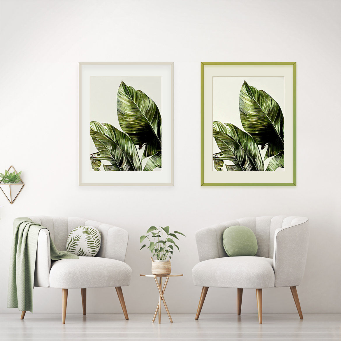
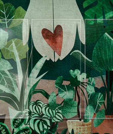
What is your interior style? That’s a small question, but asking it to your framing customer can be worth a great deal. A frame is an extension of the artwork. It focuses and centers the art in the room. And skillfully framed artwork can elevate the whole interior.
One of the greatest added values of a custom framer is the option of choice. The range of textures, colours, and glass opens all possibilities. It also provides the chance to create intriguing designs that fit into modern aesthetics. Artglass anti-reflective glass can make any colour pop, but which hues and combinations are especially popular right now?
Colours play a big role in interior design and wall decor. Colour can also be one of the hardest choices to make when choosing a custom design. That’s why it is important to inquire your customer about the aesthetics and sentiments that they want to incorporate in their home.
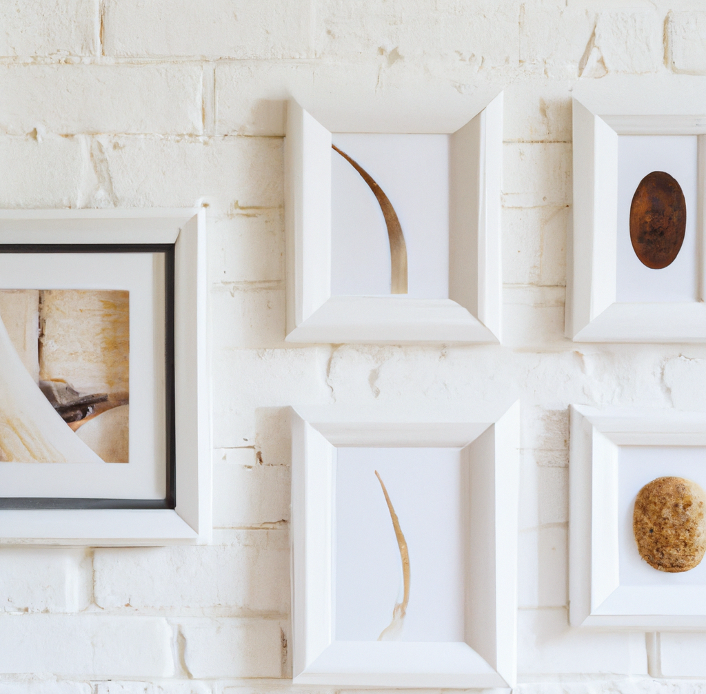
Warm colours and dark natural hues are emerging as delightful choices for decor and accent walls. Pale and nuanced neutral tones have been bringing a peaceful and calm energy to modern interiors. Even dark brown interiors are showing up in modern interiors, infused with elegant nuance and texture.
Knowing what’s trending can help connect your designs with the customer’s expectations. Here is a list of colours that the leading consumer trend forecaster WGSN has highlighted as especially popular with consumers right now. From pale natural hues to bright energizing colours, these trends represent an array of tastes and moods.
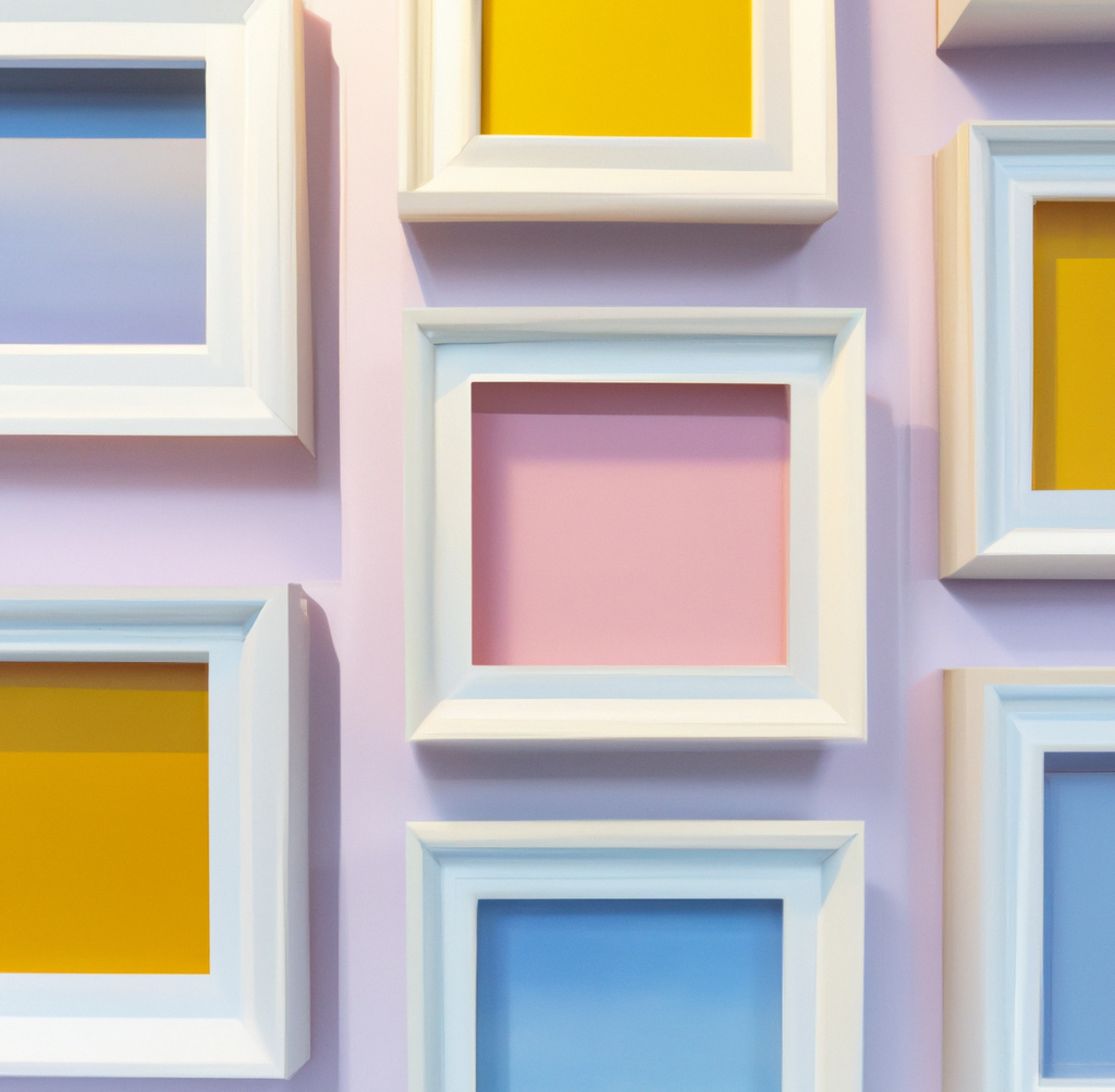
Barely-there tints and light washes of colour have a cross-generational appeal, including the ‘Colour of the Year’ – digital lavender.
A timeless aesthetic of pale colours that are refined, yet comfortable for their versatility and calmness.
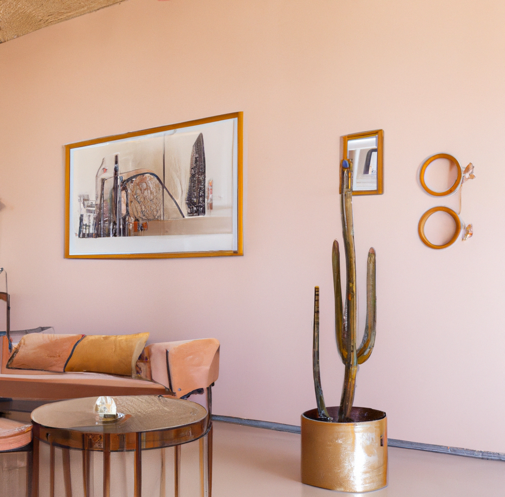
Pale pink hues, desert sand and clay hues are all emerging as the new neutrals of modern furnishing.
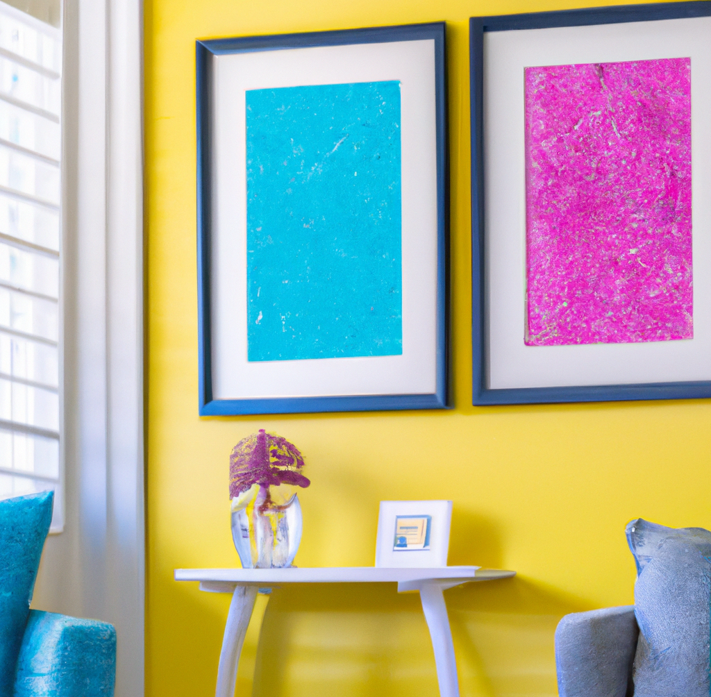
Saturated yellows and oranges bring energy and uplift to interior spaces and trend well on social media.
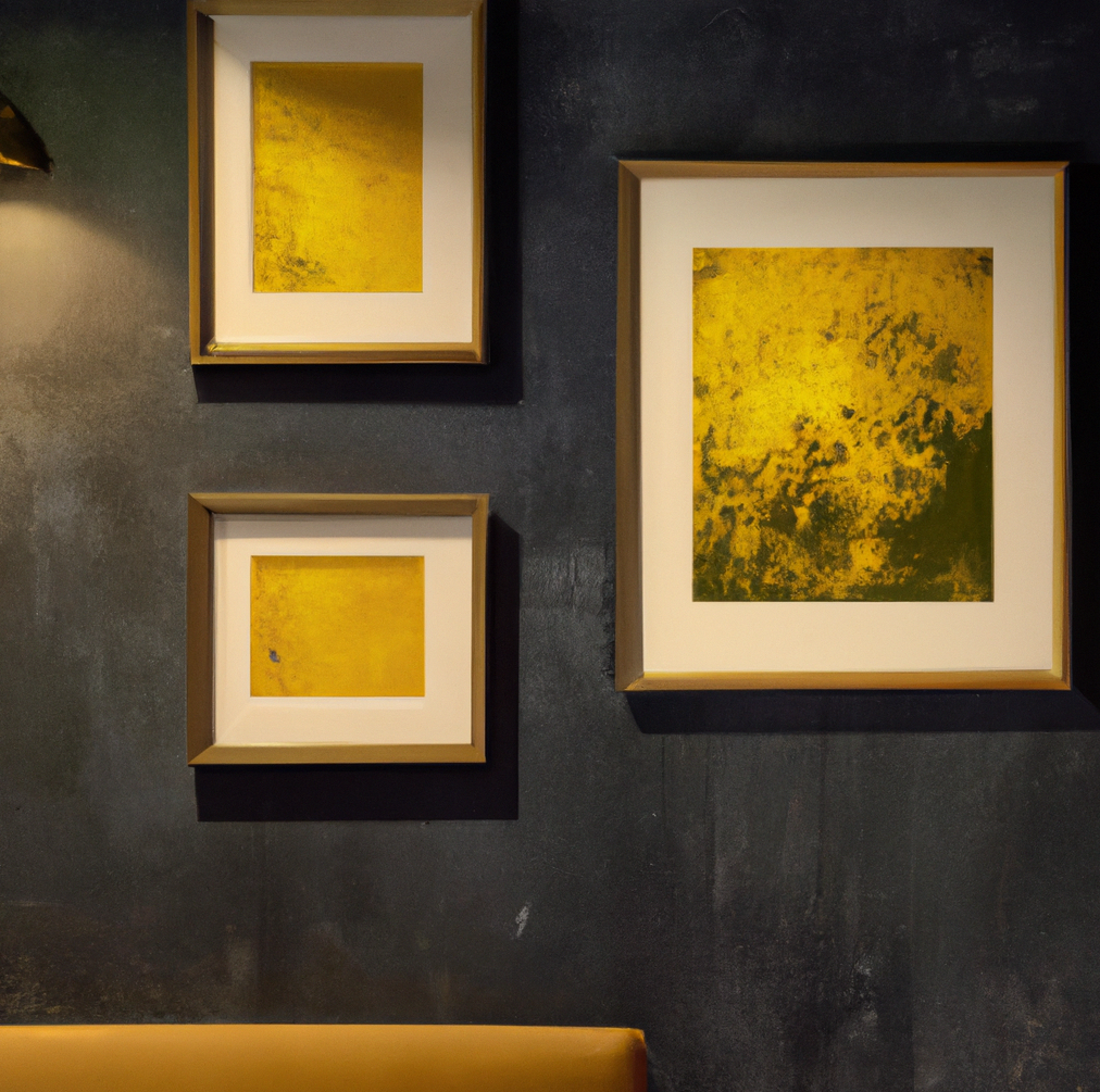
When thoughtfully used, these earthy tones create warm and inviting environments
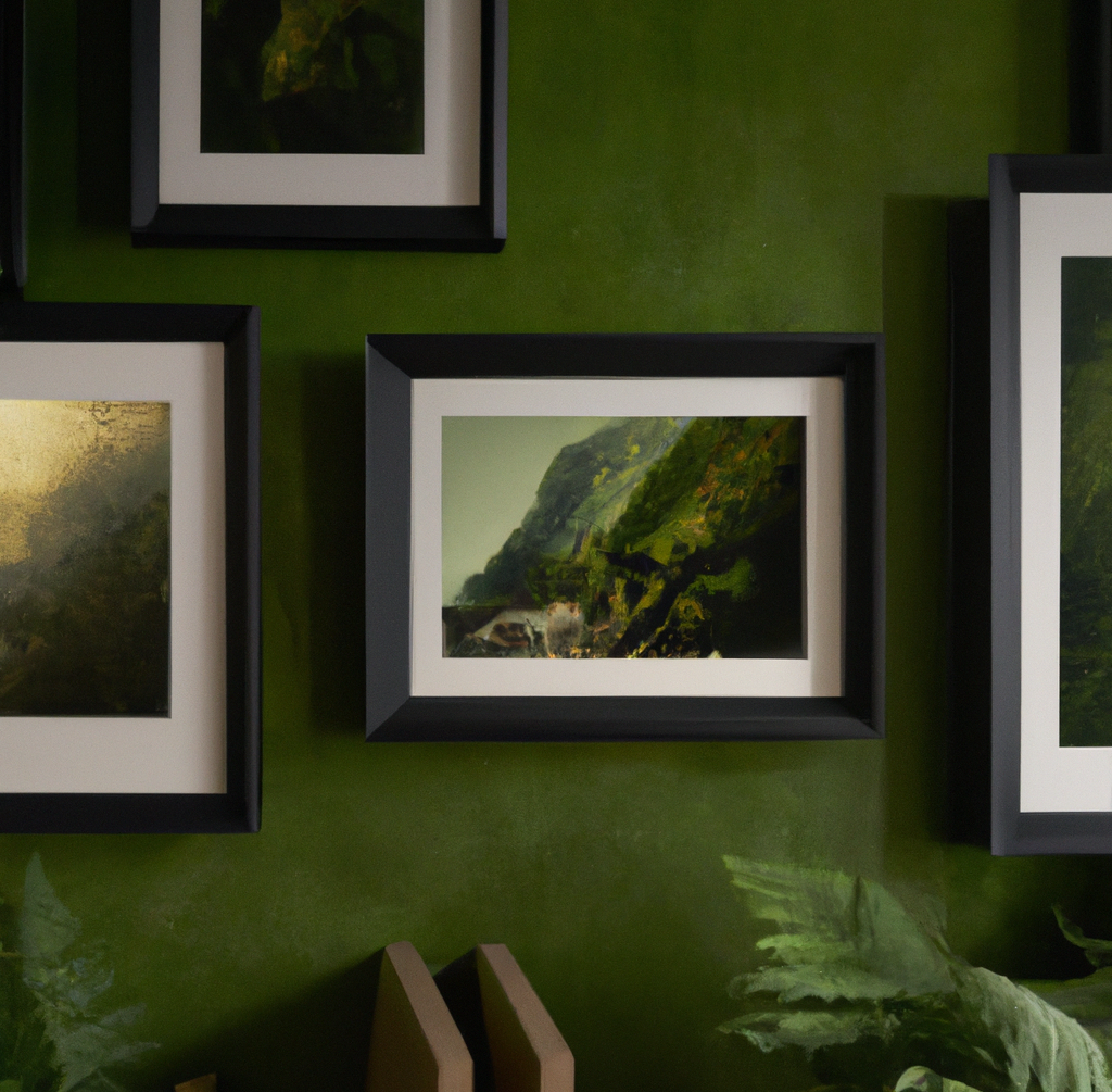
Another natural hue in the mix of colour trends is forest green – with all its textures and undertones.
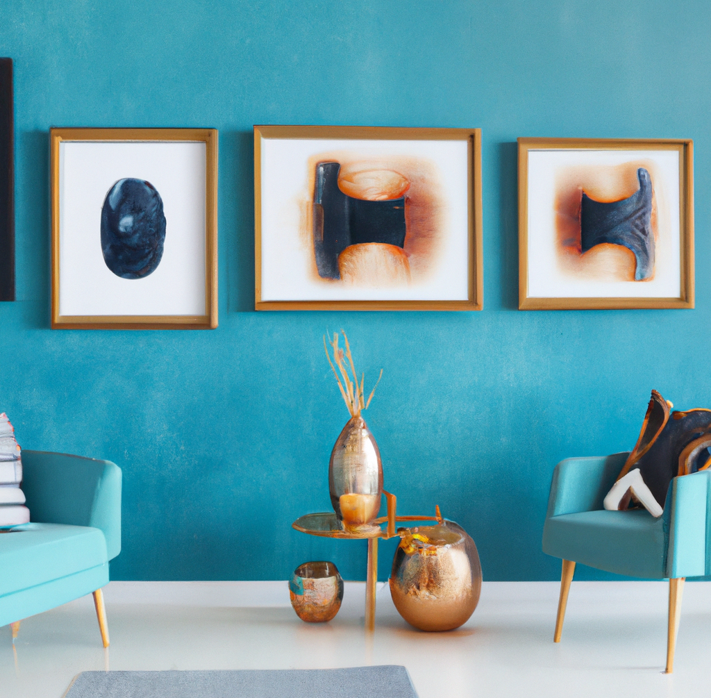
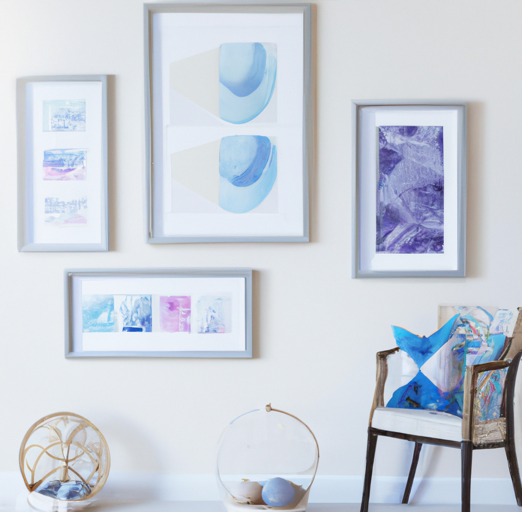
Lively blue tones are expected to fill various interior categories, from textiles furniture to decor and tableware. Picture frames need to keep up with these modern interiors and their aquatic energy.
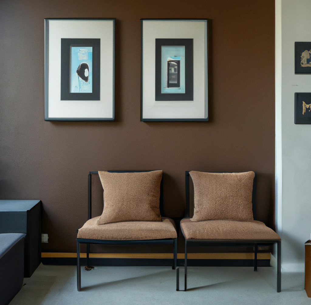
Another trendy colour that’s inspiring sophisticated and bold interiors on social media and beyond.
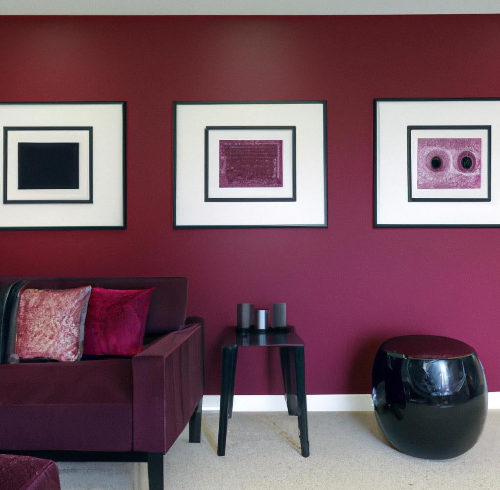
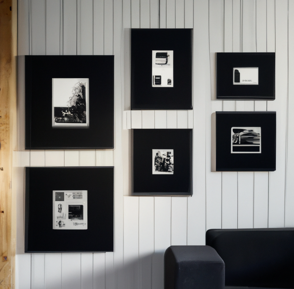
Black is continuing to be a key colour in interiors, in all its shapes, forms, and shades.
These mood-boosting colours are not going everywhere, bringing playfulness and energy to modern interiors.
All of these popping colour trends can provide a new perspective on frame designs that feel too plain or bland. To find more interior inspiration, just try researching #burgundy, #brownaesthetic or any other of these trends on social media. Your ability to incorporate different colours and textures will highlight the value of your skill and materials.
Most importantly, remember to always ask questions to your framing customer. Ask about their artwork, its importance, the desired mood of the interior and all the other relevant details you can think of. After all, they are about to find out how important picture framing is for their home.

Are you looking for a custom framer? Find out what we consider important for choosing a framing professional. Find your local custom framer on our Framer Map!
Read More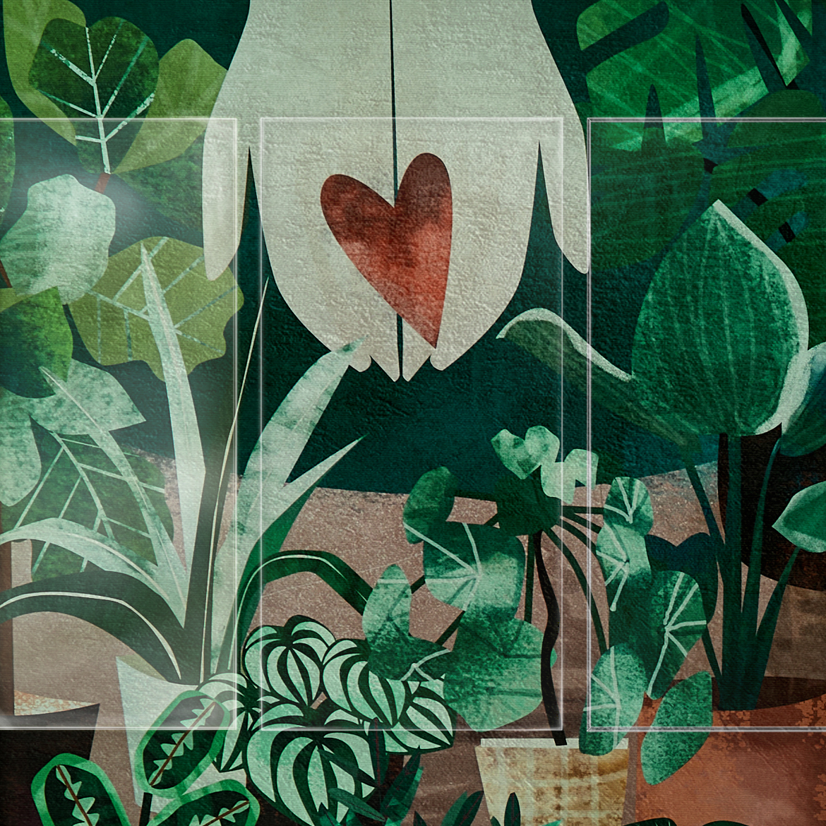
The Artglass guide to choosing the best glass or acrylic for your custom framing job. Learn the many features of glass and the questions that you need to ask yourself before choosing the glazing for your frame.
Read More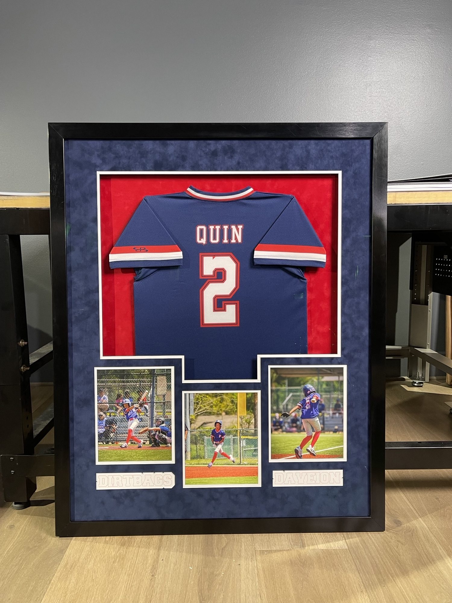
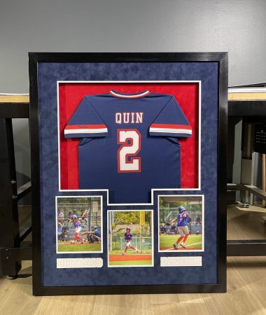
What do a former NFL player and a custom framer have in common? Read a story about Glover Quin – our friend and the owner of GQ Framing from Houston, Texas.
Read More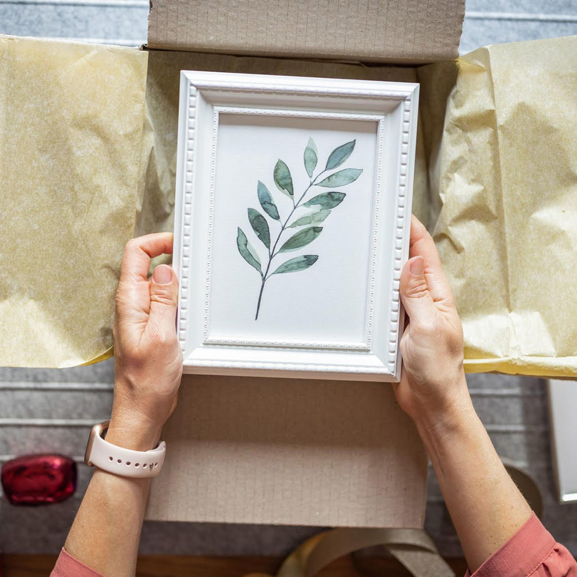
A custom frame makes a great gift for any occasion. Find out how to bring joy to your parents, siblings, partners, and friends with personal, yet well-crafted presents.
Read More
Custom framing glass has to protect, without obstructing the view of the artwork. Explore the history of glass in picture framing and the learn about the advancements in glass clarity and protection. Learn about how the clearest museum-grade glass so far – Artglass AR 99 Water White came to be.
Read More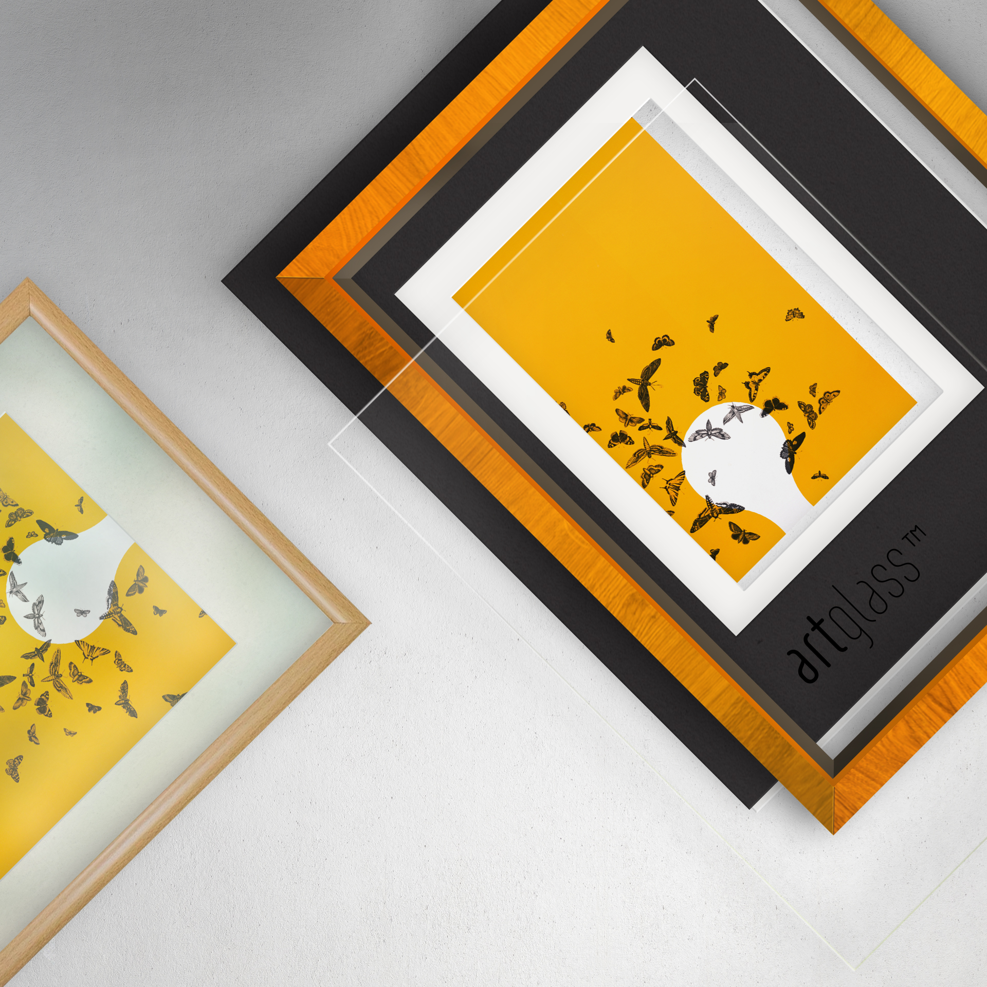
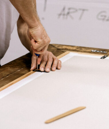
Framing is one of the most important aspects of hanging art in your home. Proper framing requires having a good understanding of how to choose frames and what to expect from the framing process.
Read More
Choosing the right display glass is crucial for museums, balancing the need to protect valuable artworks with presenting them in the best light. Artglass addresses this challenge head-on, providing anti-reflective and UV-protective glass that meets the strict demands of museum institutions.
Read More
This article explores actionable strategies inspired by the successes or limitations of big retailers, tailored to help small frame shops enhance their business and stand out in the market.
Read More
The key to differenting yourself in the market lies in finding a niche and positioning your business as a leader in quality. This is an article about Katelyn and Nathan and their unique custom framing business “Brom’s Bug Box”, which specializes in framing preserved insects.
Read MoreIf you want to find out more about our products, applications or just reach out - feel free contact us! Our team is ready to answer your questions.
Contact us